The infographics as seen in the Magicon app.
About Magicon Norway
"A cosplay convention based in the Oslo area, launched in 2022 – created for nerds, by nerds." - Magicon.no
Magicon Norway has an annual event each year at the end of June, and for each event there's new visual branding matching the event's theme. The organization also operates with a core brand identity, that ties every event together.
I've been working with Magicon Norway as a volunteer since 2021, when the event still was in the early stages of conception. My part in the crew has mostly consisted of marketing work in terms of content creation, graphical templates, infographics, managing ads, and contributing with physical work during the event. From 2022 to 2024 I had the honour of leading the organization's Info crew, the department that focuses on marketing strategies to reach the target audience. The main goal is to present information in a way that will peak people's interest and sell more tickets. We present information through various digital platforms, such as the event's website, social media, and app.
Scope
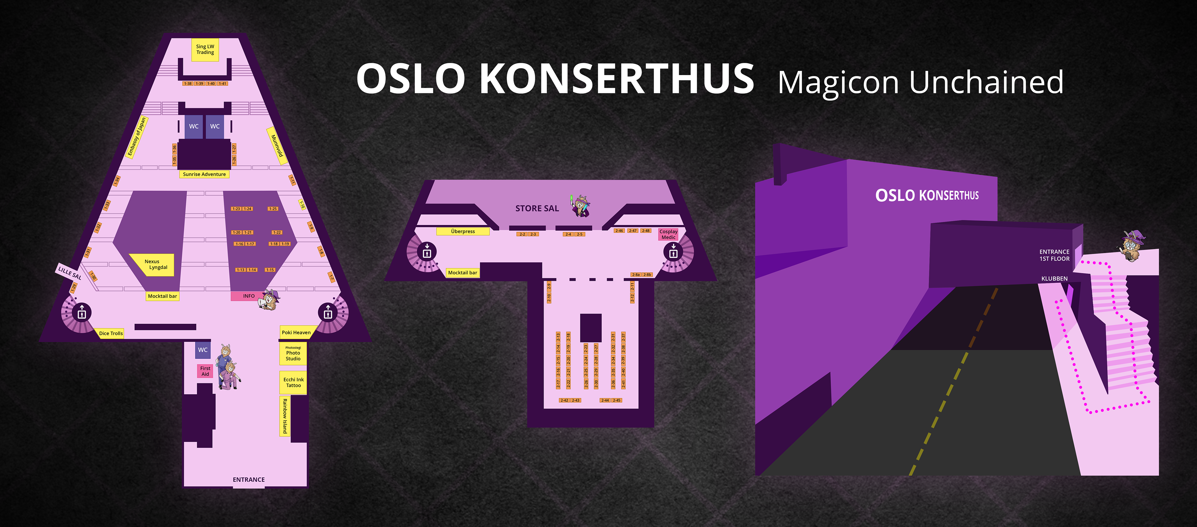
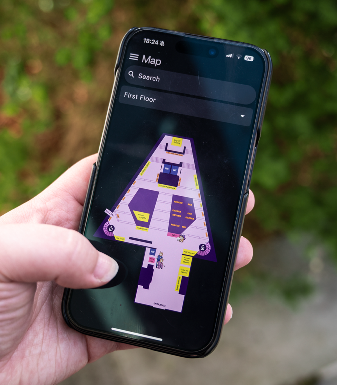
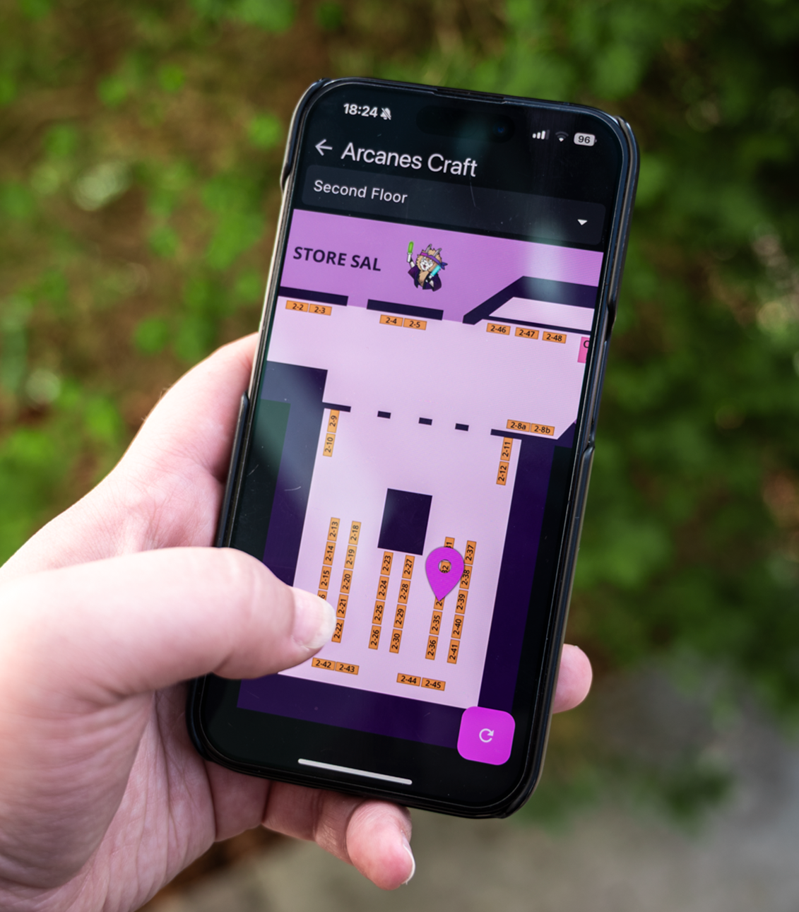
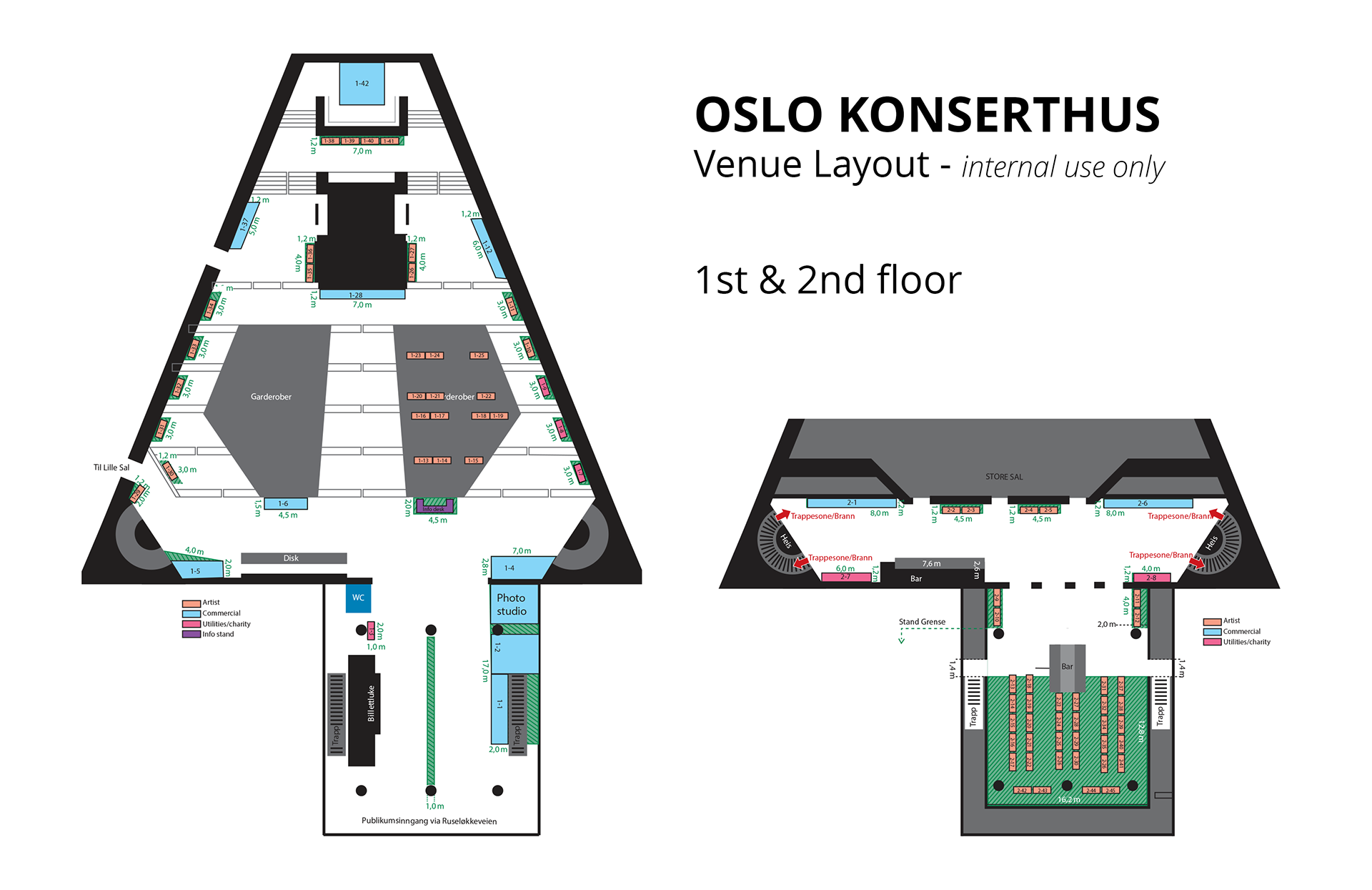
For this year's event, Magicon is being held at a new venue; Oslo Konserthus. Inside the venue there will be multiple points of interest that everyone present should be aware of if they want to navigate without running into any issues. To accommodate the needs of the visitors, guests, and crew, I got tasked to re-design the map for the venue.
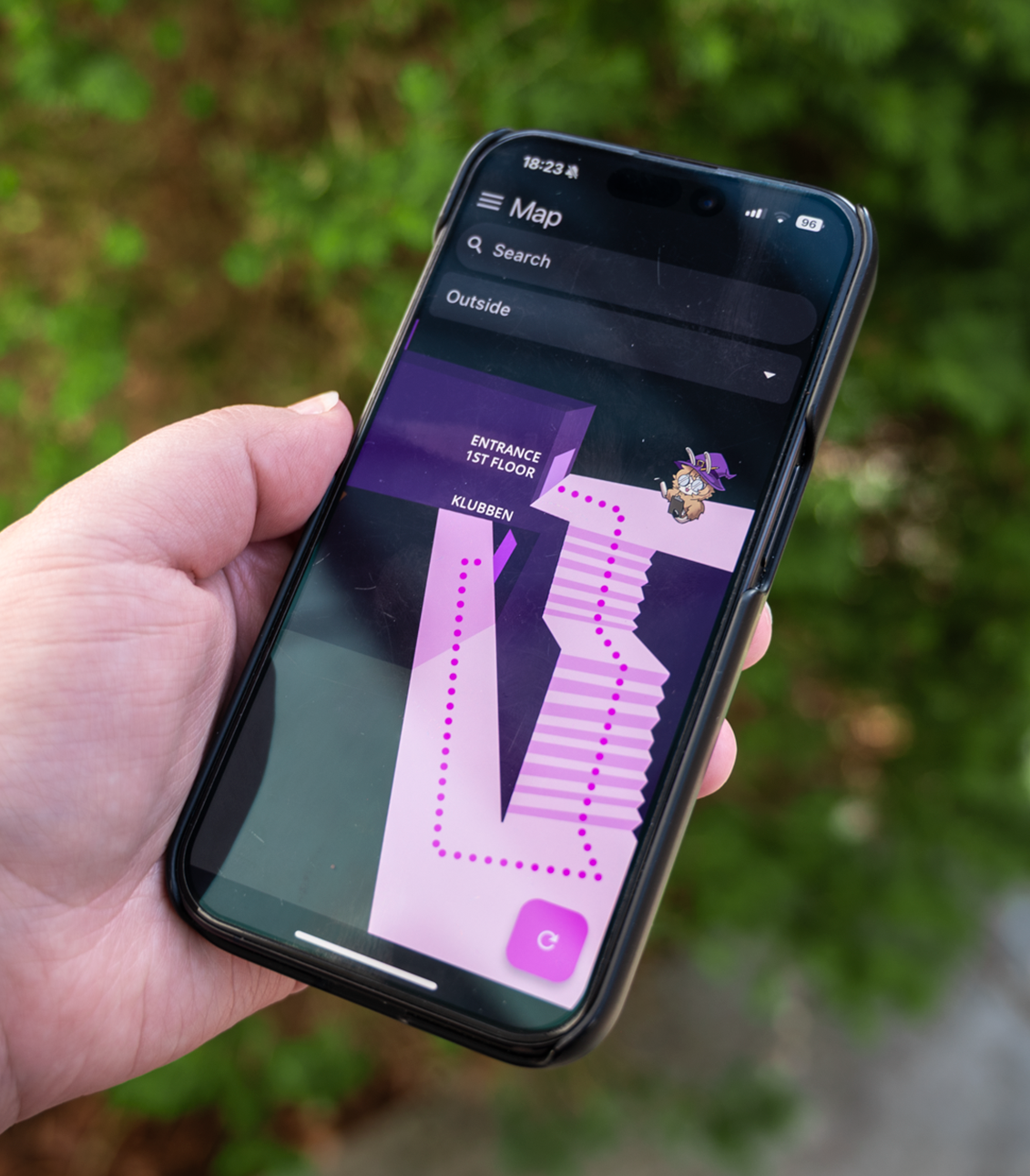
"Make a new version of the Oslo Konserthus map with elements relating to the event Magicon Unchained. This map needs to be optimised for viewing on digital platforms, specifically the Magicon App. There also needs to be a visual guide of how to get to the room in the basement.
The organisation already had a 1st and 2nd floor layout made to show the placements of different booths and areas at the event, where the base is designed by the team at Oslo Konserthus. To make it more accessible to the public, it had to be reworked to provide the right information in a pleasant way.
Progress
I made the following changes:
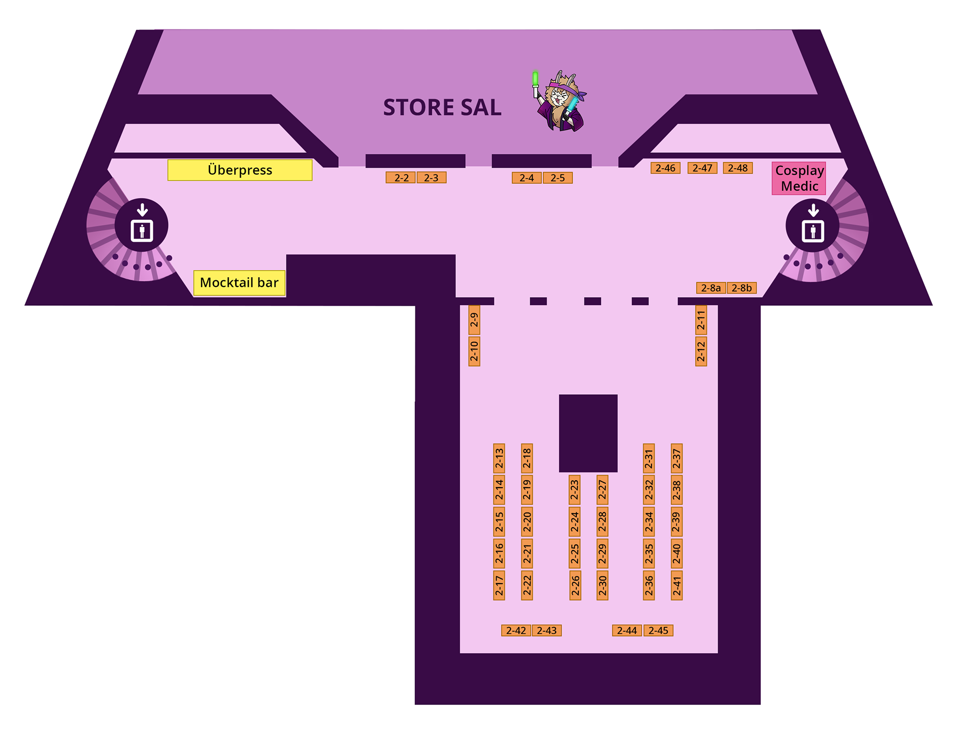
- Blocked off elements that will not be in use during the event, such as the set of staircases in the entrance area.
- Added universally known markers for elevators, and made sure all the restrooms were visible on the layout.
- Enhanced the visuals of the Lille sal entrance.
- Used dimension and breadcrumbs to show off staircase direction.
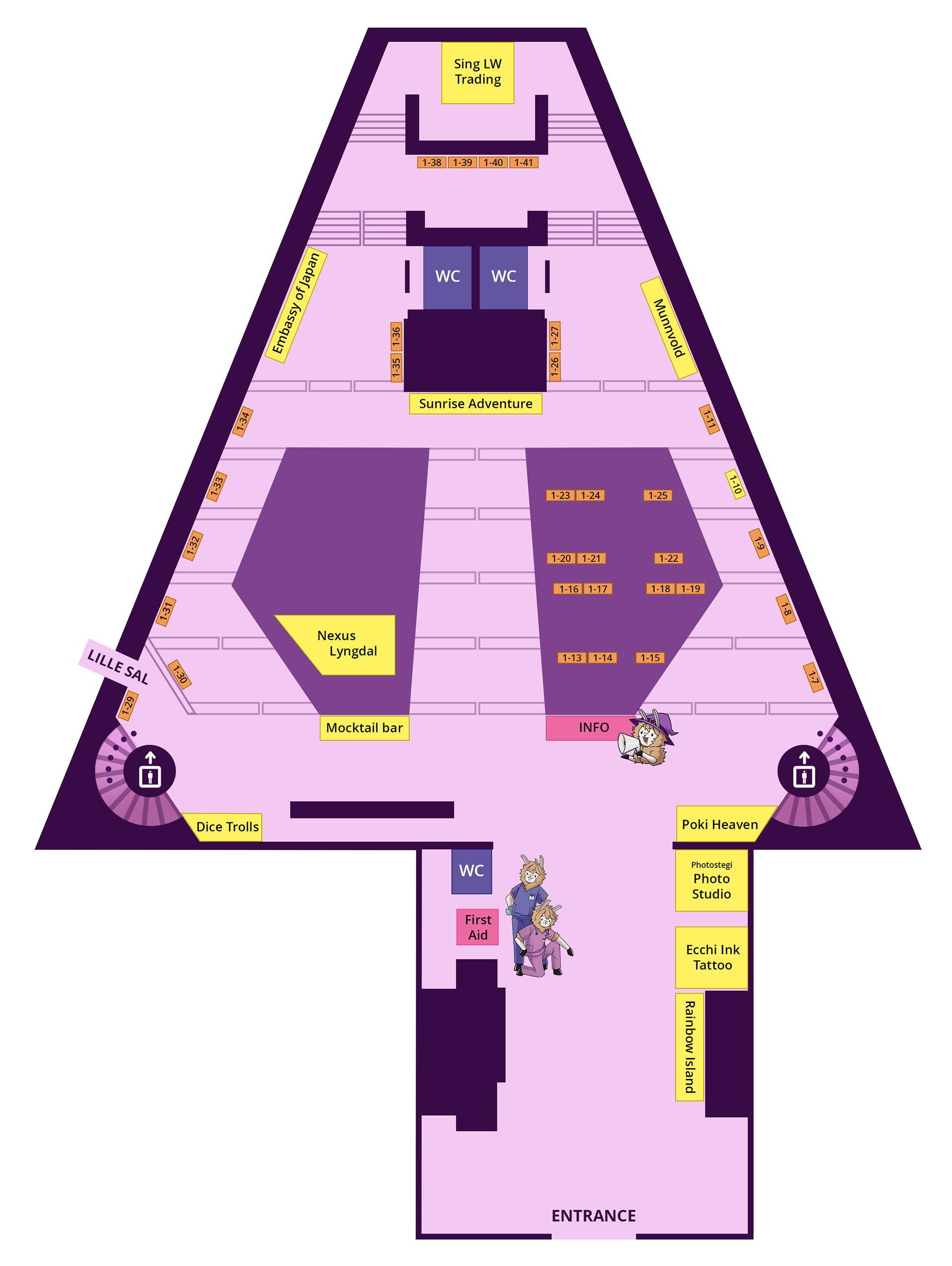
Illustrations of the event's mascot has been used to highlight important areas on the map; The first-aid booth, the info booth, and the main stage. The illustrations also gives the graphics a playful and fun feel.
I made the map in the style of the brand's core identity, so that the base map can be reused for later years. The colors have also been tested with different types of color-blindnesses in mind, to make it more accessible.
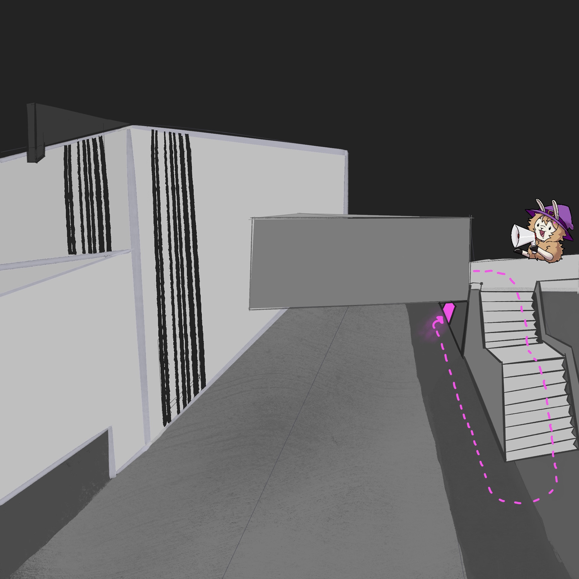
The 3D guide was made in collaboration with another crewmember who sketched the 3D layout. I was tasked to finalise the infographic to suit the look of the other map elements.
I made the following changes:
- Changed the perspective of the main entrance so it's easier to see that there's a door.
- Tidied up all lines and vectorised all surfaces
- Repeated the same visual elements and colors from the map images to connect them together.
- Added the name of the venue in the same place as in real life to contextualise that this is outside the venue.
- Added the name of the start and finish point.
Finalised design